
Documents - Graphs
In addition to the Graph feature for each document type, in Documents on the Default ribbon, you may also print Graphs per week or Graphs per month for posted document types on the User reports menu:
- Graphs → Graphs per week → Sales menu:
- Graphs → Graphs per week → Purchases menu:
- Purchases (Purchases - Supplier returns) per week
- Purchases per week
- Supplier returns per week
- Orders per week
- Graphs → Graphs per month → Sales menu:
- Sales (Invoices - Credit notes) per month
- Invoices per month
- Credit notes per month
- Quotes per month
- Graphs → Graphs per month → Purchases menu:
View graphs
You may filter and view the documents in a graph.
To view the documents in graph, you may use the following options for the data to be included in the graph:
- Document types - Select the document type (i.e. invoices, credit notes, quotes purchases, supplier returns or orders).
- Document status - Select All, Posted or Unposted and Confirmed (Quotes and Orders).
- Filter options to select the documents to include or exclude from the graph , etc.
To view the documents in a graph, click on the Graph button.
To close the graph, click on the Graph button again.

|
|
In this example, the amount due is lower than the amount inclusive. This implies that the invoice is partially settled with payments or credit notes, linked to that invoice in the Open item link. |

Example : Filtered by Address 3

Customize Chart
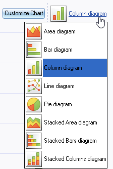
Customize Chart : Types
The default chart diagram is the “Column diagram”. You may select the one of the following diagrams to view the graph.
Customize Chart : Series
By default, only the Amount inclusive and Due amount and Tax amount is displayed.
You may remove the tick of the series or add a tick to a series. For example, if you wish to see the amount exclusive, tick that option and if you do not wish to view the tax amount, remove the tick.
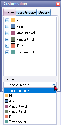
Sort by: select the options in the series to change the sequence of the documents in the graph is displayed.
Customize Chart : Data Groups
The Data Groups will list all the columns headings (field names) of the Document selection screen.
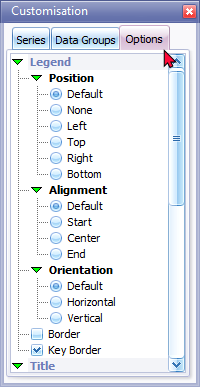
Customize Chart : Options
You may change the default values for the “Legend, Title, Toolbox” and “Other (Value Hints)“ according to your requirements.
Customize Chart : Data groups
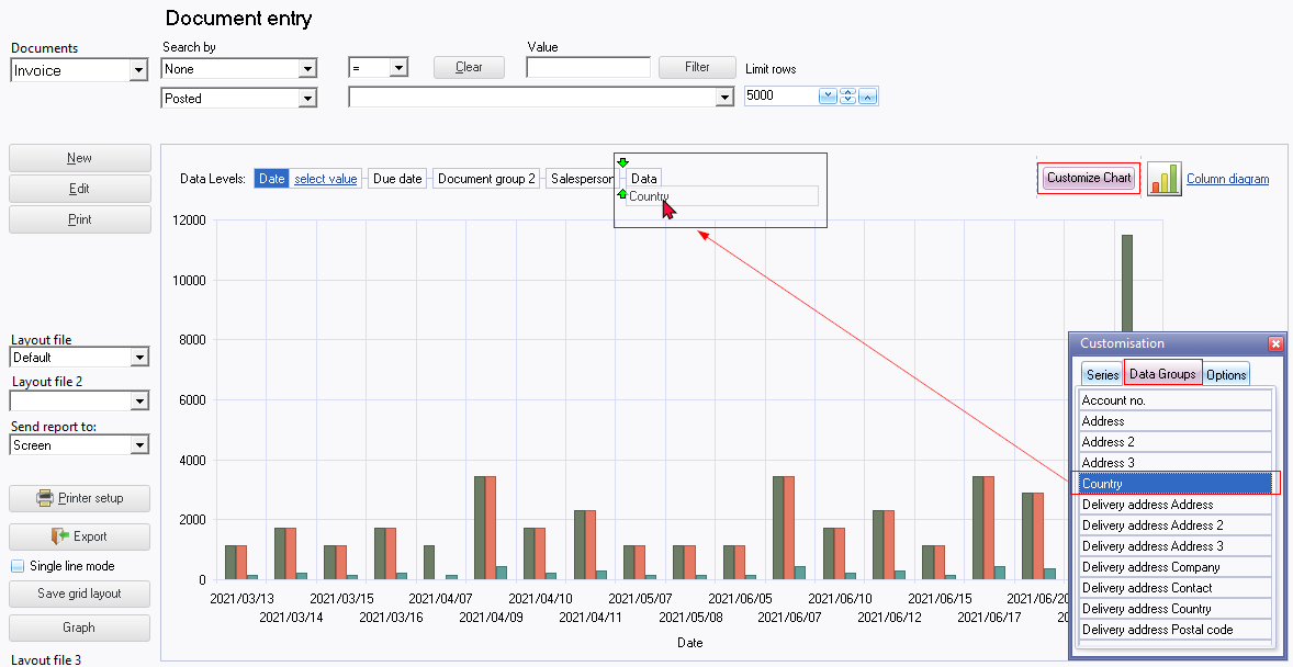
The data groups list all the available columns on the Documents grid, which is not already set as "Data Levels". You may add or remove any of the available Data Groups on the "Data Levels".
To add a "Data Group" to the "Data Levels":
- Click on the Customize Chart button.
- On the "Customisation" screen, click on the Data Groups tab.
- Select the available data group form the list you wish to add to the "Data Levels".
- Drag and drop the data group to the required place on the "Data Levels".
To remove a "Data Group" from the "Data Levels":
- Click on the Customize Chart button.
- On the "Customisation" screen, click on the Data Groups tab.
- Select the available data group on the "Data Levels".
- Drag the data group to any place below the "Data Levels". When the mouse pointer change to a big X, drop it. The data field will be added to its original place on the list in the "Data Groups" tab of the "Customisation" screen.
